

Table of contents
Why Flexbox
CSS has never been kind to any developer. Just a tiny change and the page will be upside down. So extra care is needed while creating layouts. Generally, we use position and float property to create a required layout. But the problem with using position and float is that we need to be extra careful while adding new elements. And also these layouts are not responsive.
Here comes the CSS flexbox as a savior. Using Flexbox we can easily create beautiful layouts. We can make them responsive with very little effort.
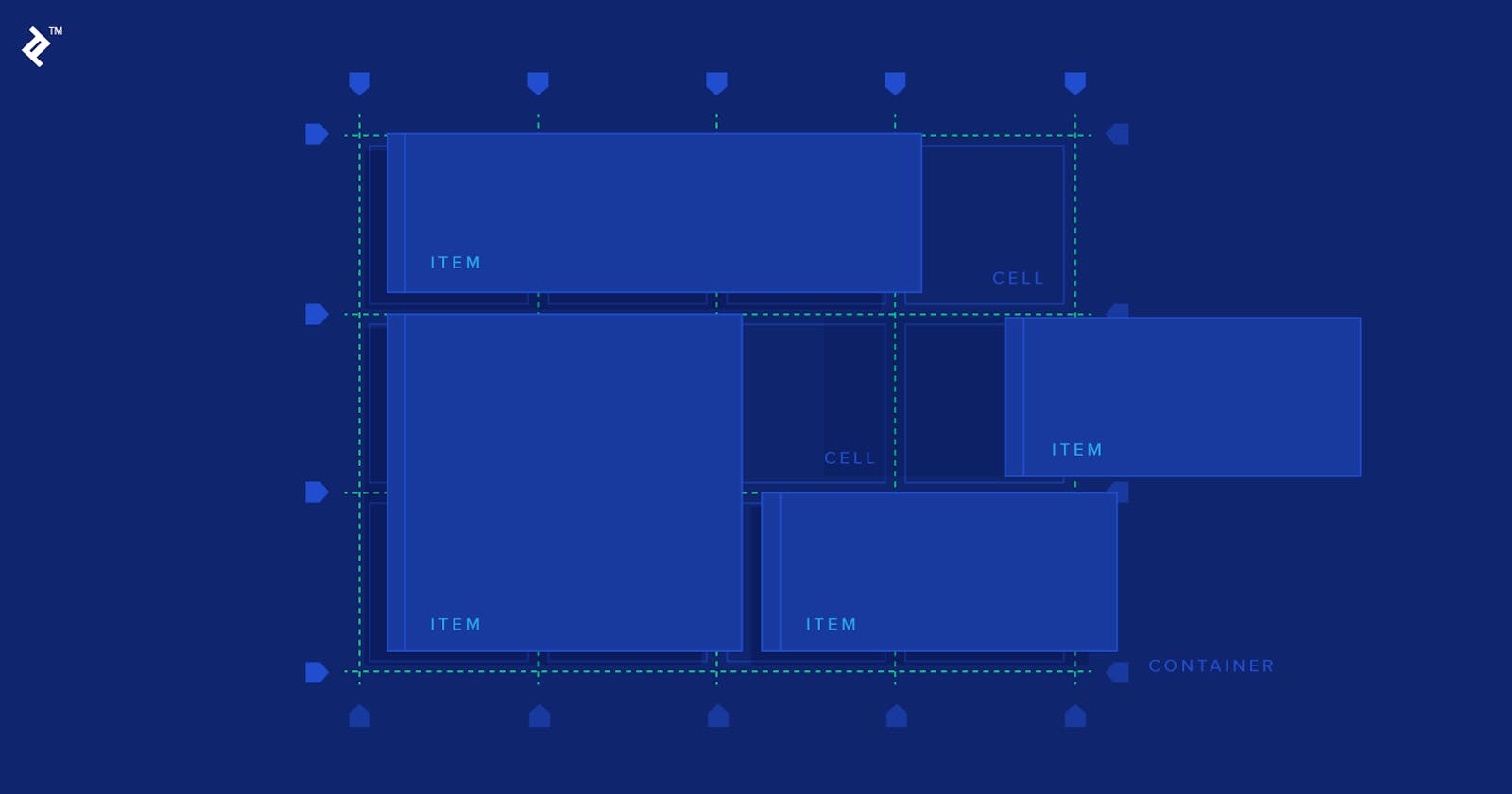
Flexbox has 2 axes, the main and secondary axis. Axis decides how elements are going to place in the container. To Understand better, let us take a container with 3 elements in it.
<div class="container">
        <img src="./ineuron.png">
         <img src="./mascot.png">
         <img src="./lco.png">
 </div>
Flexbox properties
To unlock flexbox properties, we first set the display property of the container to flex
 .container{
  display:flex;
}
flex-direction
It decides the direction of flex-elements
.container{
    display: flex;
    flex-direction: row | column | row-reverse | column-reverse;
}
flex-direction:row;
It arranges the flex items from top to bottom.
flex-direction:column;
It arranges the flex items from left to right.
flex-direction: row-inverse;
It arranges the flex items from bottom to top.
flex-direction: column-reverse;
It arranges the flex items from right to left.
justify-contents
It will align the flex items along the main axis.
.container{
    display: flex;
    justify-content: flex-start | flex-end | center | space-around | space-between | space-evenly;
}
justify-content:flex-start;
justify-content:flex-end;
justify-content:center;
justify-content:space-around;
justify-content:space-between;
justify-content:space-evenly;
align-items
It will align the flex items along the cross axis.
.container{
    display: flex;
    align-items: flex-start | flex-end | center | space-around | space-between | space-evenly;
}
align-items: flex-start;
align-items: flex-end;
align-items: center;
align-items: stretch;